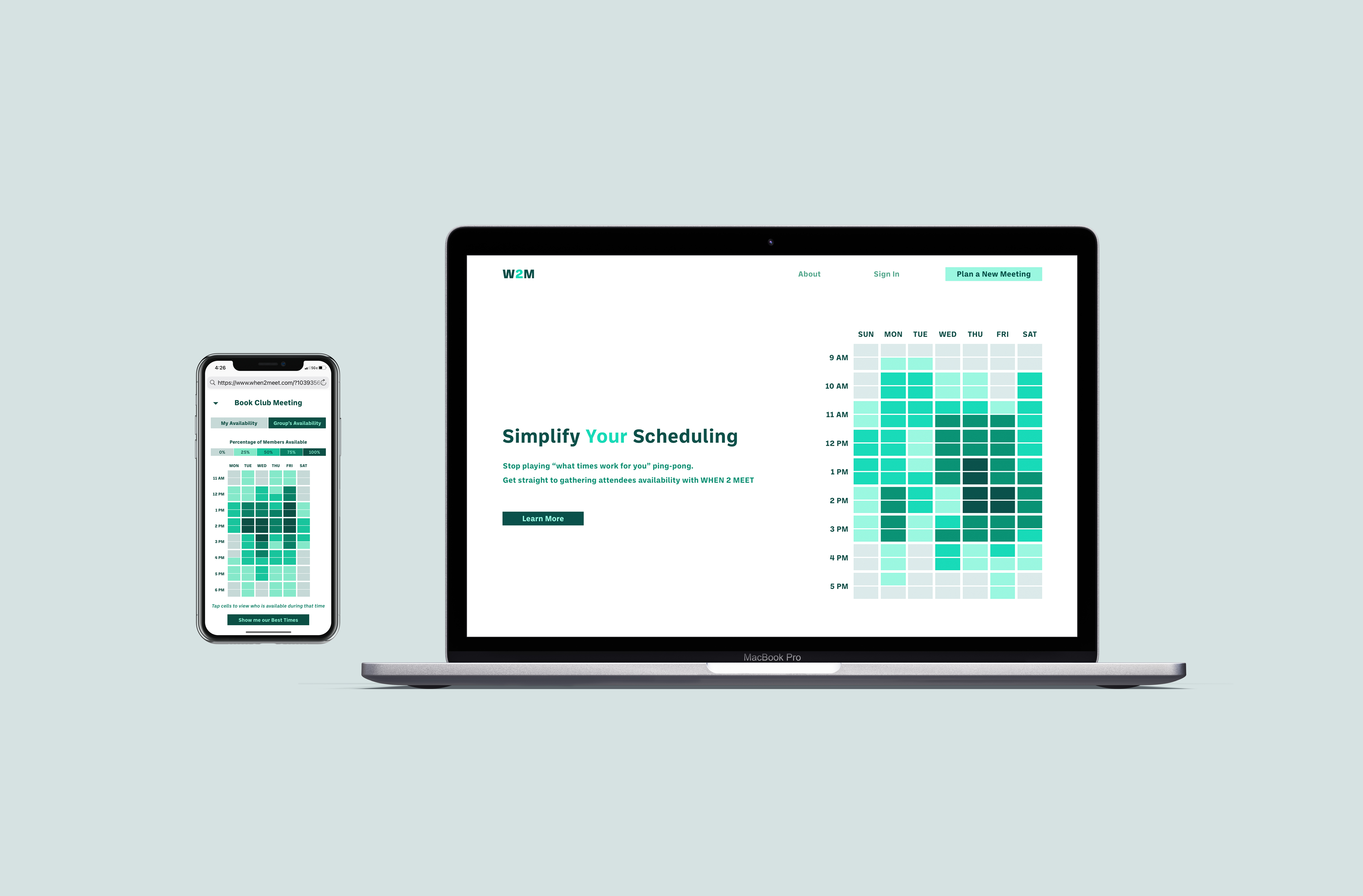
When2Meet (rebranded from When2meet) is a straightforward availability gathering product that aims to streamline the back and forth planning for meetings and events with multiple attendees. By putting in a few structural details of the potential meeting, the product generates an availability matrix for the user. They can then share a link to this matrix with potential attendees to quickly and easily assess aggregate availability.
Having a strong user base that really enjoys the current version of the product made testing and proposing any changes quite a balancing act. However, upon testing the current system, it became apparent that there were pain points users were encountering that needed to be improved upon to secure return and long-term users.
I conducted interviews, surveys, and user testing to understand the motivations of the users. My initial goal was to look for features to add or modify that would increase the value or appeal of the product. However, as I better understood user preferences it became clear that the current functionality and simplicity were the core of its strong draw with users. Opportunities to improve the product were centered around modifications to the user flow and appearance rather than its capabilities.
The proposed redesign stays true to the strengths of When2Meet’s current features and functionality while making adjustments to the appearance and user flow, both of which were primary drawbacks of the current design. The redesigned appearance fits with expectations of a modern, professional productivity tool. Modifications to the user flow clarify what information or actions are needed.
To get a better understanding of When2Meet’s draw in relation to competitors, I began looking into SaaS products that provided similar features. I found that while there are numerous other scheduling and availability gathering products, they didn’t seem to have the same strong user base and loyalty that When2meet has. My conclusion was that When2Meet’s single function focus allowed it to be simple and quick to use. Other products added features that require more steps and complexity.
I created surveys to conduct with the current user base to identify why they choose to use When2Meet over other scheduling products. As a follow up to the survey, I interviewed users about their experience with competitor products and how they compare to When2Meet. From both the survey and follow up interviews, I learned that users' primary use for When2Meet is availability gathering. While some competitive products were scheduling applications that included an availability features–some quite similar to When2Meet–that feature could not be used with attendees who are not using that same scheduling app. By focusing on providing a single primary feature, When2Meet becomes a solution that anyone can use without compatibility concerns.
To get a feel for how users interacted with and what they thought of the current system, observation sessions where held. Here I had users go through setting up a new event while narrating what they were seeing and doing.
Doing this walkthrough helped me to identify some critical pain points in the current system. The largest point of criticism users had with the product was the look and feel of the interface. While many expressed that they enjoyed using When2Meet, they noted feeling hesitant before sending it off to others because they felt it looked unprofessional.
I utilized cardsorts to allow users to help inform me of the purpose and context for their use of the product. I wanted to use this knowledge to shape potential additions and revisions.
The cardsorts revealed that many users utilized other products to complete their scheduling process. For them, When2Meet was primarily an availability gathering tool that they would reference when needed. Since the simplicity of the product was the main draw for many of it’s current users, I wanted to prioritize the modification and seamless integration of current features.
Previous observations and conversations with users continually brought me back to the topic of When2Meet's interface. Some users noted that they felt embarrassed to send off the link because they worried how it would reflect on them as an individual, business, or organization. A few users even expressed that the look and feel of the product alone deterred them from using it.
The insights gathered from users shifted my focus from seeking features to add to the product, to highlighting and refining the structure of the interface and existing information. When2Meet was successful in understanding the needs of its current users by prioritizing efficiency over attractiveness. However, to increase its user base and create more repeat users, the product needed to have an appearance users could take pride in.
To see how users responded to the colors and layout of the redesign A/B tests were conducted. Users responded best when the colors clearly indicated when certain steps were complete. They also responded well to specific sets of colors. To see if a color customization feature would be a good addition availability matrices with color variations were tested. With four different color variations, six separate A/B test were conducted. The results of these tests were totaled collectively to measure which color set effectively communicated user availability.
These tests showed a strong association between the color green and users perception of items being clickable and indicating availability. While these associations with the color green where notes I came across in my secondary research, I was surprised to see how relevant they were here. When presented the four color customization options, a majority of users not only chose green but noted that the matrix being another color gave them a sense that it had an entirely different purpose.
To create task based testing prompts, I first created user types. These user types are essentially micro user personas based on users and stakeholders I had been testing with thus far. Many of When2Meet's users being students, entrepreneurs, or apart of small businesses and organizations, inspired aspects of the user types created.
I then created task-based testing prompts and questions that matched the needs of certain user types and paths they may take through the product. With these test prompts, I wanted to evaluate the information architecture of the product and if users were still able to accomplish their goals with revised interface. The prompts created fell into two categories. The first category was navigation prompts that presented different scenarios encountered while using the product. The second category was user flow prompts which provided users with details for the set up and send out of meetings.

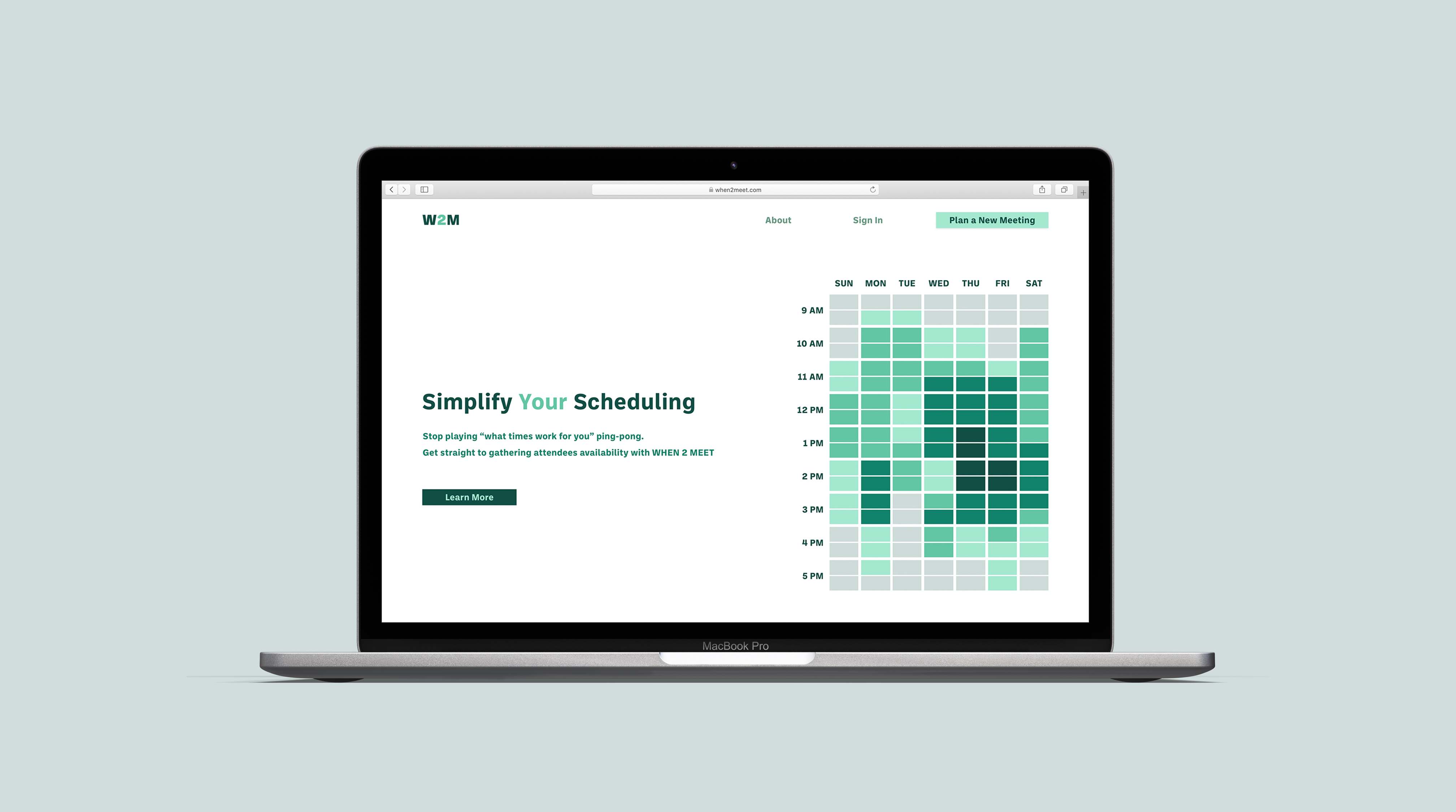
As users land on When2Meet's site they are given the options to learn more about the product or to plan a new meeting.
On the landing page, users are given a preview of the main product, the availability matrix. The clear and simple language next to the sample matrix conveys the main goals of When2Meet and introduces users to the language structure used on the site.
In planning a new meeting, users provide details about the meeting such as its name, the days or dates it may take place, and when the earliest and latest times the meeting could be. Gathering these details is broken up into steps, each providing brief instructions on what needs to be entered and how.
The set up of a new meeting is broken into three simple steps that help walk the user through the set up process. As each step is completed, it turns dark green to indicate that the necessary fields have been filled. This helps reduce the confusion of which information needs to be entered first and if it has been entered correctly.
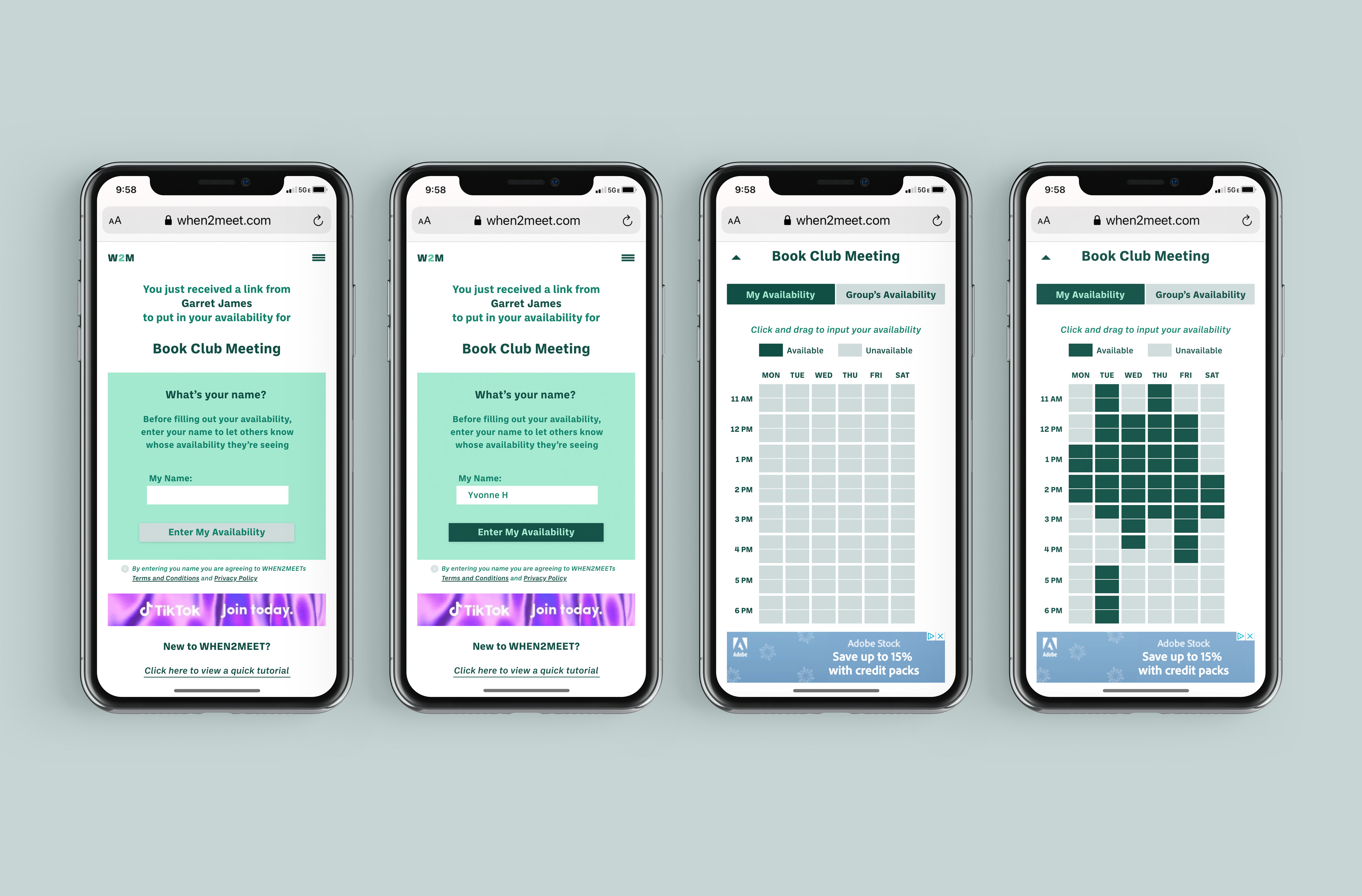
Once a user has finished creating their meeting, they are taken to that meeting's availability matrix. Here they enter their name and then their availability for the meeting in question. When finished, the user can copy the URL and send the link off for other attendees to enter their availability.
Since the click and drag interactions from the current design were received well by many users, a refreshed version of the interaction was included in the redesign proposal. Because When2Meet's main source of revenue is from ads, they have been integrated into pages of the redesign. Ads are on pages and in spaces where there is little to no click interaction by the user. This allows for users to complete task with fewer accidental clicks that redirect them to new pages.

The link attendees receive takes them to an information page that lets them know who sent the link, what the meeting is for, and has a link to a tutorial if they are first time users. They then enter their name and input their availability for the meeting.
Information on the meeting is presented upon opening the link to make sure attendees are provided all the necessary details. This helps reduce additional back and forth between users to clarify background information. A link to a tutorial is listed on this page to reduce the amount of searching for new users.

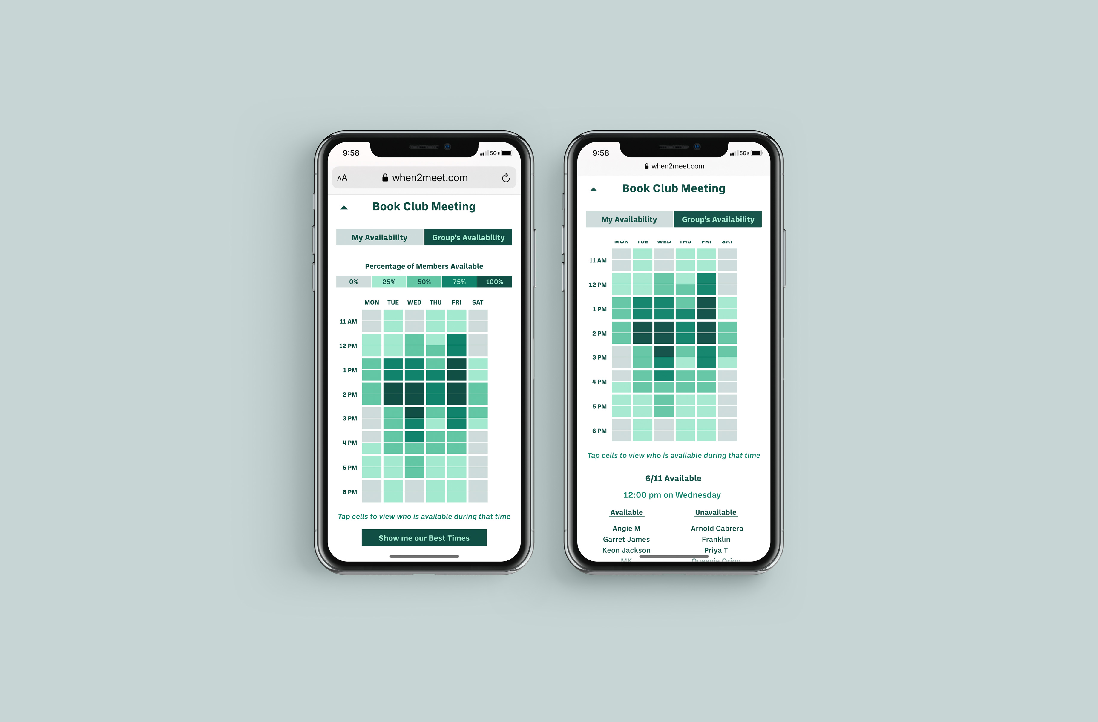
After an attendee enters their availability, they can toggle between viewing the group's availability and viewing or making edits to their own. By tapping (or clicking on non-touchscreen devices) on cells in the matrix, they can view who in the meeting group is available at that time.
The functionality of the availability matrix stayed true to the product's current system since it was an area that the users responded well to and was a key function of the product. The redesign of the availability matrix pages focused on making the interface's structure responsive to multiple device sizes since many users notes accessing When2Meet on the go.