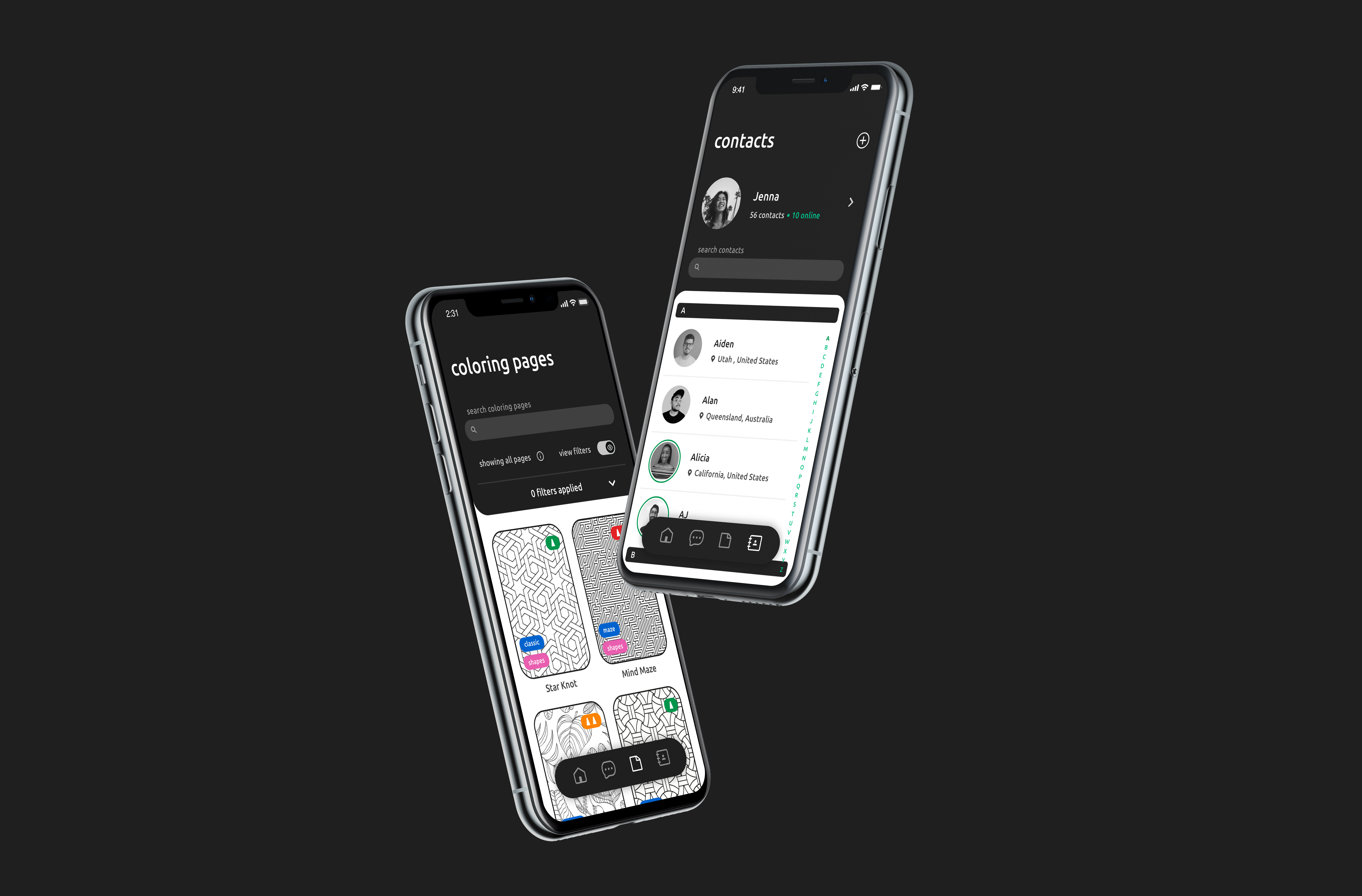
Many people have found that coloring, an activity traditionally associated with childhood, is a fun and satisfying pastime for adults. In 2019, I completed a packaging project focused on the challenge of creating a package design for crayons that clearly communicated it was a product for adults. The purpose of this follow-on project in 2020, was to develop a mobile application to translate the fun and satisfaction of coloring into a digital experience for the same adult coloring audience.
While coloring is great as a solitary activity and that mode meets the needs of some colorers, many people like to share their creative pastime with other enthusiasts and use it as a basis of social interaction. The challenge addressed in this project was how to add collaboration to a coloring mobile app.
Initial interviews served to confirm widespread interest in combining coloring with social interactions. They also raised questions of how the actions and feelings of coloring related to the actions and feelings of social interactions. Interviews and surveys provided insights on these questions and informed the product design.
The design aesthetic of the application mimics the physical experience of coloring: the environment is black and white with the only colors being those of the crayons. The interface design was guided by the development of collaborative coloring or "buddy color" mode. In this mode, two users work on completing a coloring page while having a conversation via the un apps voice call feature.
In 2019 I completed a project to redesign a crayon box to target the adult coloring market. Research had shown that while there is a growing demand for adult coloring, many enthusiasts are timid about their hobby due to the childhood associations. My design leaves behind the utilitarian square shape and bright colors of elementary school in favor of a sleek, black monolith with the primary feature being the holes through which the crayon colors can be seen. The shape of the monolith box was inspired by the tip of a sharpened crayon. When opened, the crayons are presented in an accessible array for easy selection.
The strong interest I received in the crayon box encouraged me to pursue this follow-up project to further address the adult coloring market. One aspect of adult coloring, in contrast to the childhood activity, is that adults have fewer large blocks of leisure time to dedicate to hobbies. Leisure time for adults often comes in shorter blocks with less planning. Adult colorers will not always have coloring implements and a book when time becomes available. A mobile app for coloring would allow adults to pursue this hobby any time a few spare minutes become available. When considering mobile applications, it’s natural to consider the communication and social aspects of mobile phones. This lead to the concept of adding a collaborative coloring as a main feature of the application to differentiate from competitive products.
Although the concept of Collaborative Coloring seemed appealing, I wanted to confirm that it had general appeal with others. Through concept validation surveys, I found that coloring, typically an activity that an individual does on their own, was indeed something people were interested in doing with others.
While the survey confirmed a general interest in collaborative coloring, I still needed more insight on users experiences with both coloring and social interaction. Specifically, if there were connections between the actions and emotions associated with coloring and socializing, the design would need to facilitate or at least accommodate that connection.
I created a cardsort to further explore what users feel and experience while coloring or socializing. I used a set of closed categories, four centered around coloring and an additional four centered around socializing. The categories for both coloring and socializing mirrored one another, allowing to me see the connection users had between the two.
Although there was strong indication that people would like to socialize while coloring, the card sort results showed that many of the feelings associated with the two activities were opposites. Many users indicated that coloring made them feel at ease but that socializing made them nervous. I realized that perhaps the appeal is to do them together – the positives of coloring could counteract the negatives of socializing and vice versa.
Through prior research, I found commonalities and complimentary aspects between the coloring and socializing. However, some of the aspects that were common between or complimented one another were not always beneficial to the user. This led to realization that in order for Collaborative Coloring to be successful, the app would have to work to reduce the impact of, or correct some of these overlaps.
Looking at the research as a whole allowed me to narrow down what Collaborative Coloring would be in this digital application and how it would be presented to the users. In order to create an accommodating experience that addressed the multiple ways users interact and color, I formulated How Can We statements to refine the initial goals for creating the product and the nature for its user interactions.
To help construct the flow of the app around the interaction between two users, I created user types based on information gathered in prior research and testing. These user types, aside from the solo colorers, were grouped into pairs based on how they would go about creating invites, receiving these invites, and coloring together. Using these pairings, I created task prompts to test if the app could effectively connect users.
To help make testing more fun and interactive I gave users prompt cards with their user type and a goal to accomplish. Due to varying availability for users to test, I made prompts that mirrored one another so two users could test separately while accomplishing their half of the user pair prompts. After users completed acting out the actions of their test prompts, I walked them through what happens on the other end of the prompts they ran through. Showing them what the user they were interacting with saw allowed them to see if what they saw on their end translated to an understanding of what their buddy in the app would see.
During testing with the rough prototypes, I collected a lot of feedback from users about the interface, flow of the app, and certain visuals. Many users were calling for simplification of the coloring sheet (now coloring page) selection process, and clarification on the meaning of certain visuals.
After gathering feedback from the users, listed out the main pain points of the design so far and began ideating on ways to improve them. From there, I created a feature prioritization grid to help narrow down the features users truly wanted and needed. This helped nail down the informational architecture so I could move to refining the design system and interface.
I conducted A/B tests to allow users to indicate which options felt the most intuitive. While testing rough prototypes, I noticed users having differing opinions on how much information they wanted on the screen at a time. To span the divide between these varying preferences, I introduced dropdowns, and toggles to view or hide information.
From these A/B tests, I concluded that many users preferred color differentiation in selection options. Highlighting the information that was most relevant to the user or indicated the action they need to accomplish next helped users understand the process in which steps needed to be accomplished on each page.
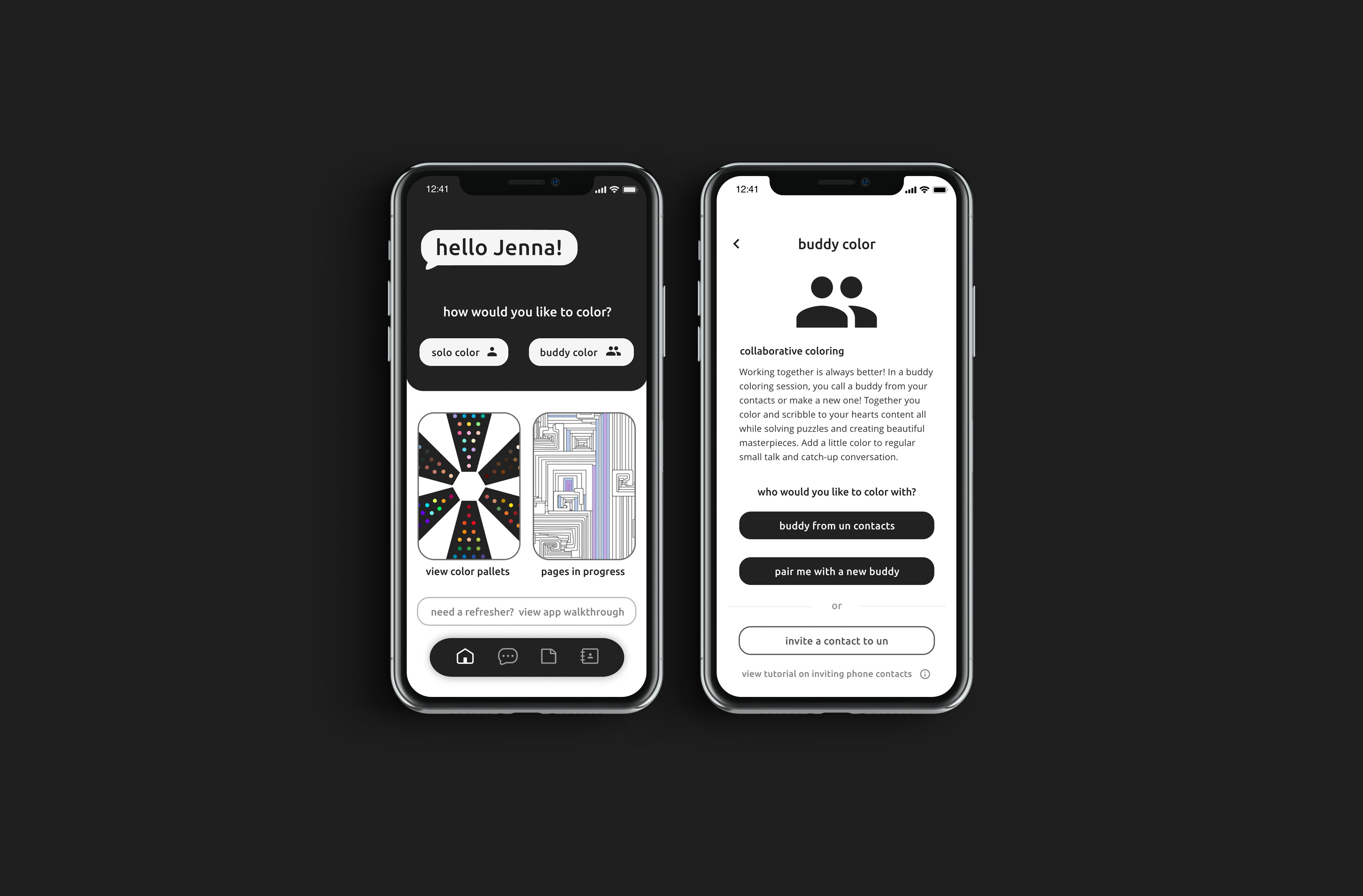
On the home page of the app, users are greeted by name and are met with a CTA prompting them to start a coloring session. From this page, users can access incomplete pages, color palettes they’ve created, and can revisit the app walkthrough.
Since the main function of the app is for users to color, the home page hosts buttons to get started with creating coloring sessions or starting a solo coloring page. Brand language terms are introduced early on to get users familiar with the apps structure.
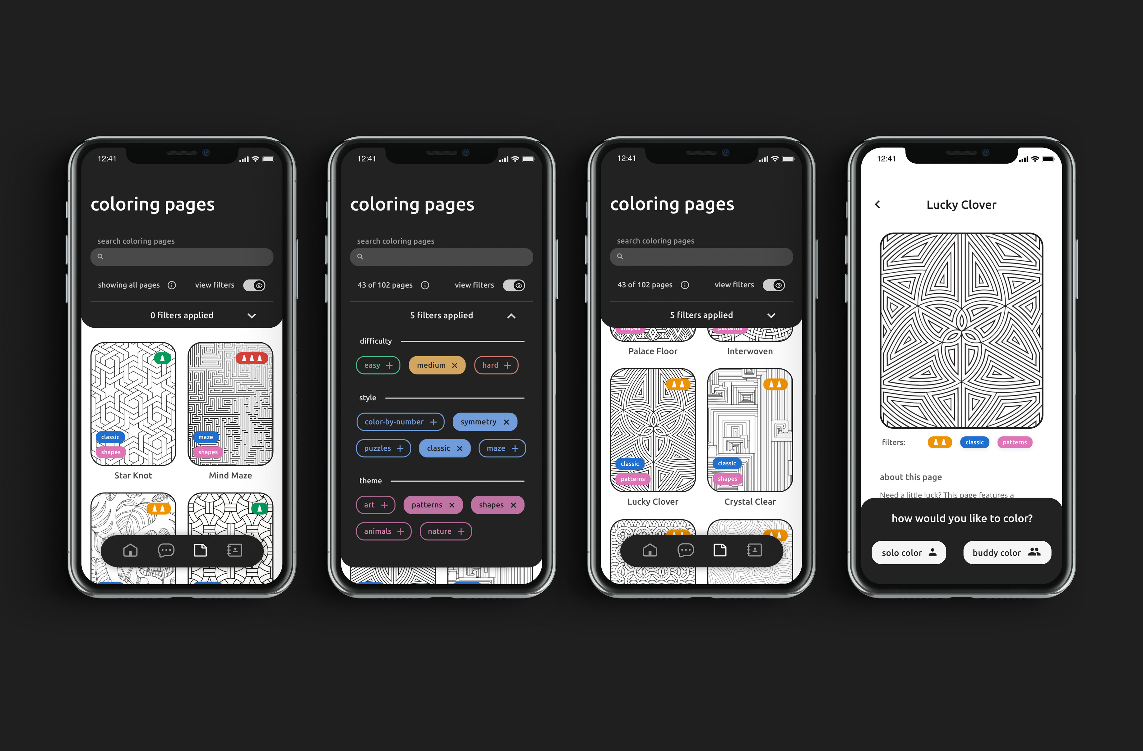
In coloring pages, users can browse the selection of pages. In the filters dropdown, users can refine the selection of sheets they are viewing by difficulty, style, and theme. The display of these filters can be turned on and off to suit the users preferences.
To simplify the page selection process, the user is provided with filters to narrow down to pages they are interested in. Description information is listed on individual pages for quicker searching and viewing.
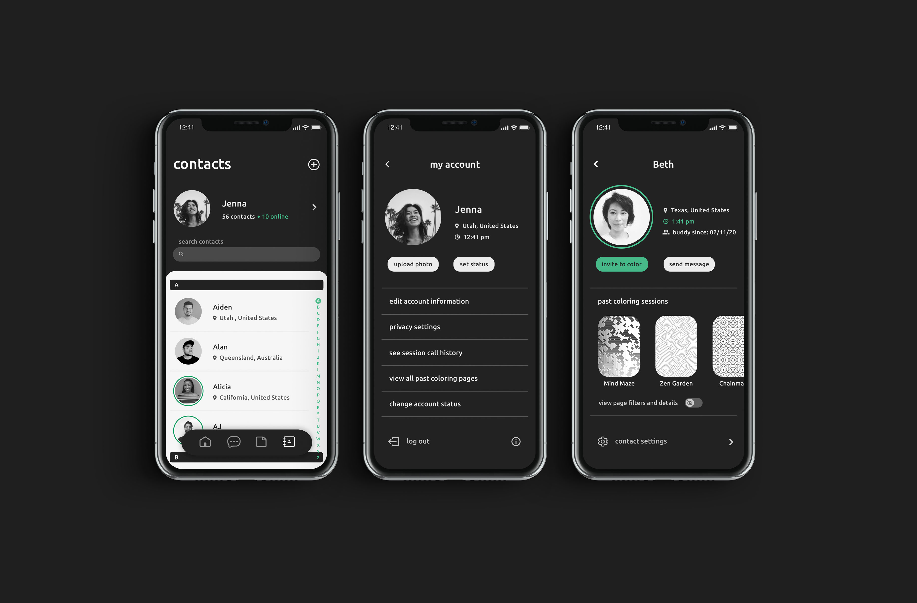
In contacts, users can browse through their buddies, see who’s online, and invite other users to color. Through the contacts page, users can adjust their account settings. On an individual's contact page, users can view past coloring sessions with that buddy, send messages and invites to color.
Because socializing is a central piece of Collaborative Coloring, adding information about yourself and managing a list of contacts is key. Important information like a users current time and location are listed to avoid invites being scheduled at inconvenient times by users in different timezones. When one of the users buddies is online, their image is framed with a green halo and their time is set in the same green. This helps communicate to the user that a buddy is active and ready to collaborate.
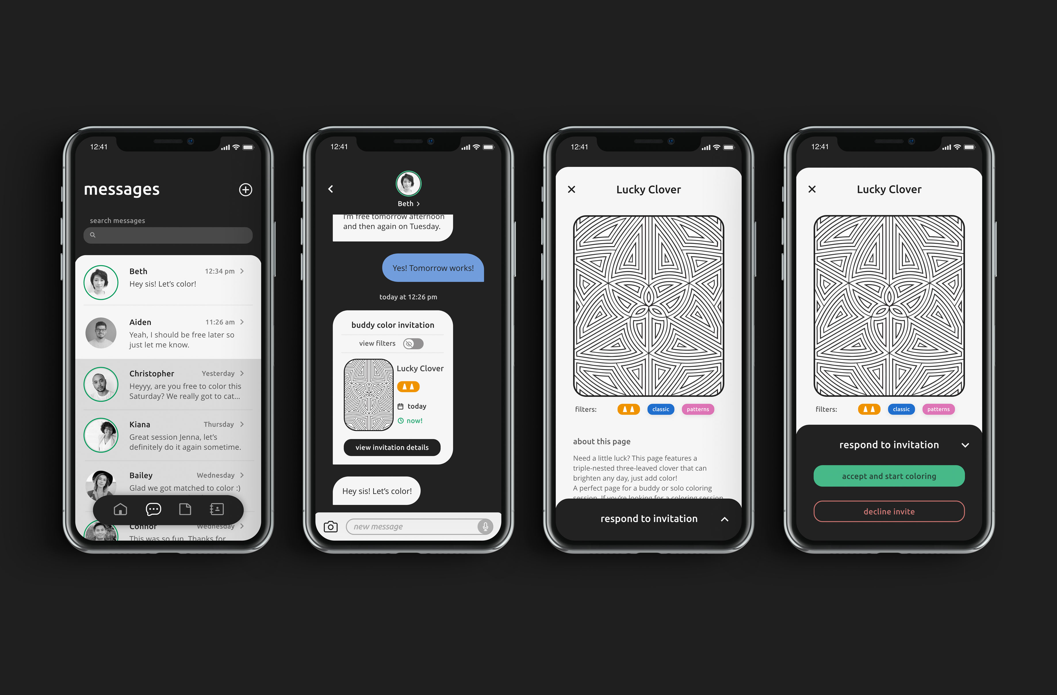
In addition to sending and receiving texts, "messages" is where users receive invitations to color. Invitations are shown within a thread of messages between buddies and include the title and thumbnail of the proposed coloring page and details about the invitation session. Clicking the invite shows a screen with full-sized coloring page. In this screen the user can respond to the invite to accept or decline the invitation.
Since many users noted feeling uneasy exchanging numbers with people online, un provides secure in-app messaging for conversations to continue safely.
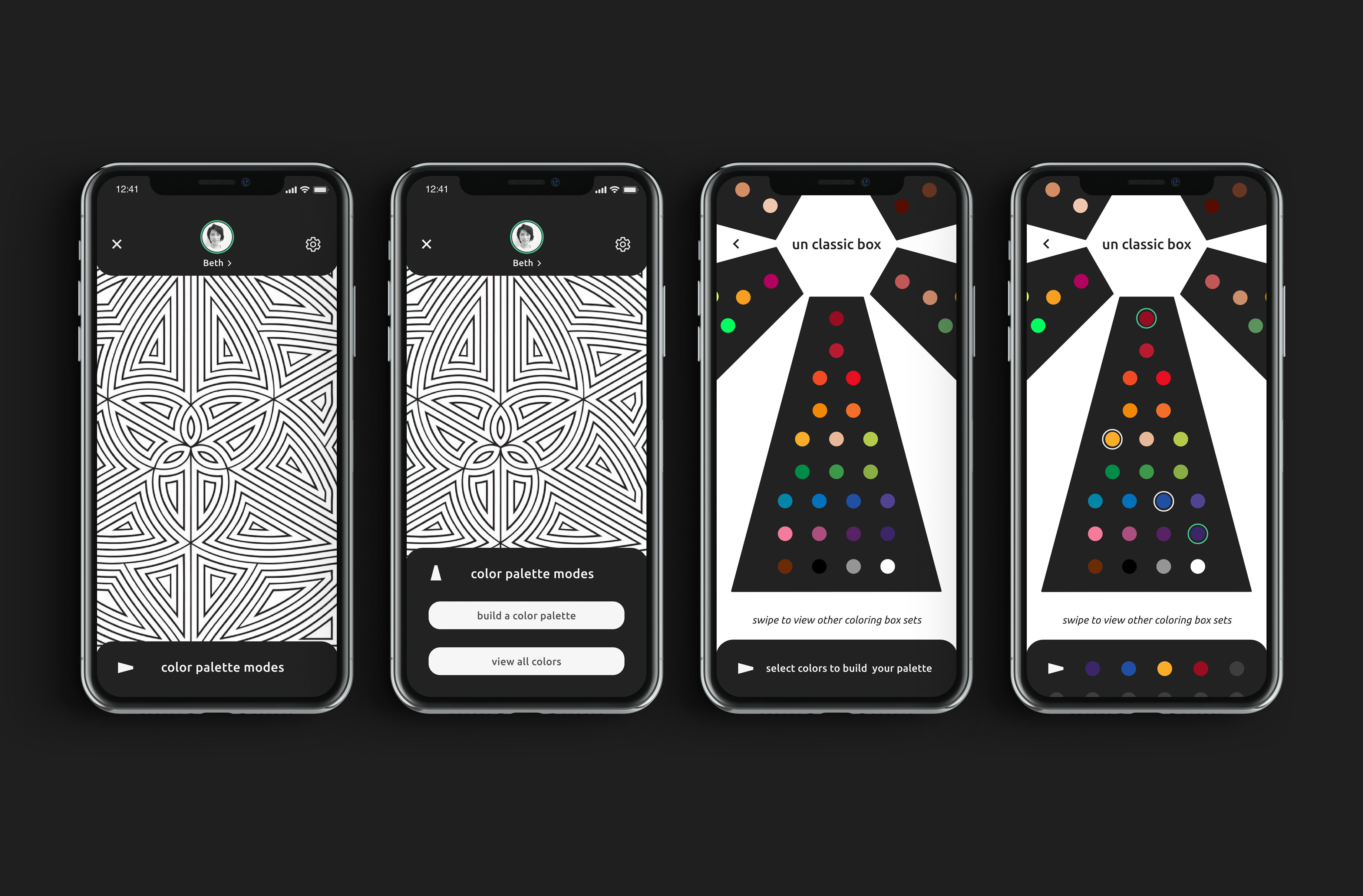
Upon accepting a coloring invitation, the pair of users are taken to the coloring page. At the bottom of the new coloring page is color palette set in default mode. By opening the coloring palette, users can pick from one of two coloring modes, build a coloring palette or view all colors. In build a coloring palette, the pair of users selects the colors they want to work with and can create a custom palette for their coloring session.
In testing, many users noted feeling overwhelmed when they had too many color choices. Limiting the range of colors on the app and introducing the customizable color palette setting, allows users to narrow down their selection of colors while collaborating.
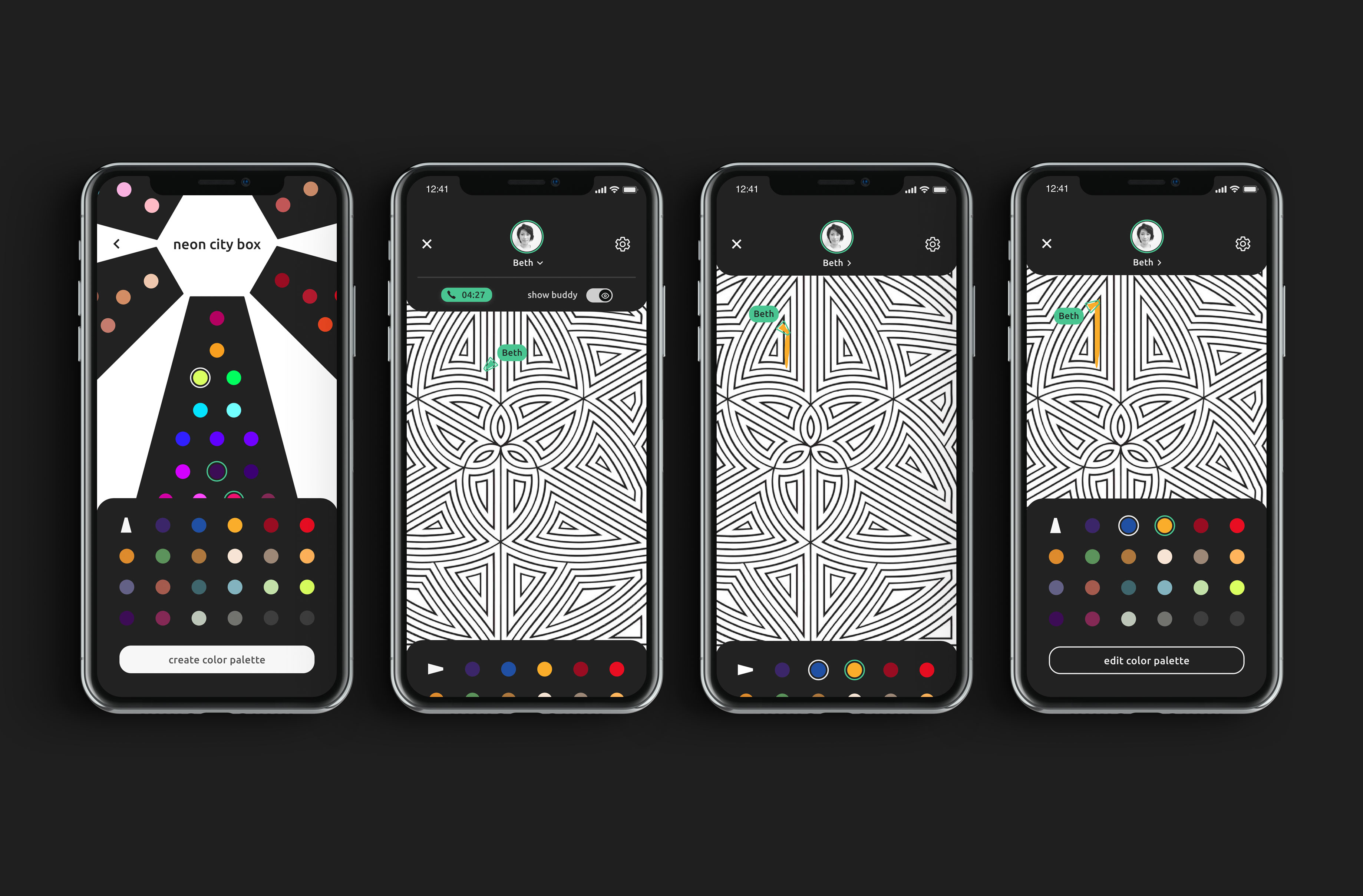
Once users finish adding colors to a custom palette they can press create and start using it. Back on the coloring page, users can view the sessions call time, show or hide their buddy’s cursor, and collapse and expand the view of their color palette as needed.
In order to give users as much coloring real estate as possible, the color palette and settings are collapsible or in dropdown menus. Allowing the user to control how much and what they are viewing while coloring lets them customize their coloring experience.